Monday 24 January 2011

Editing Program

Once all my pictures were taken I imported them into Aperture for organising purposes and to save them at the highest resolution possible.  I then exported them for ease into iPhoto where I did all my editing.  I chose not too tamper too much with my original images as I dislike over processed shots.  Due to this the only things I made adjustments to were saturation and occasionally highlights, shadows and the sharpness of the image.

There was however one shot that I imported into Photoshop to enable me to clone out a distraction in the composition that I didn't notice when I took the shot. 

Theme 1: Autumn - Getting to the Final Image

Here you can see the main adjustment is saturation, enhancing the colours in the image making the autumn leaf more dominant and the contrast clearer between the ivy leaves and the yellow autumn leaf and the grey of the wall.

Thursday 20 January 2011

Theme 2: Fashion/Shoes - Getting to the Final Images

In order to get to the final image I was happy with there was fortunately little editing to be done.  The main 3 forms of editing I did use were saturation to enhance the colour of the image, cropping, straightening and cloning.


This shot shows the editing of the saturation levels.
This was the only shot that required cloning to remove a stone at the end of the pillars, it was my first time on Photoshop and I was pleased with the outcome.


Cropping was another tool I used in order to remove distractions and bring the eye into the main focal point.

Starightening was another editing tool I used which is great for those awkward low down shots that have been taken a little off balance!

Theme 2: Fashion/Shoes Final Images and Why?

Having taken the majority of my Autumn theme images at Calke Abbey I decided to take the following shots at Sutton Scarsdale Hall ruins to bring a secondary theme of  English Heritage meets High Fashion.  From this I believe the below images are representation of this theme while capturing the detail the product, the shoes.

The shots below I have chosen as they were my favourites from the days shoot.  Having had my time again on this I may have brought in some lights and put my tripod to use as it was cold and difficult to keep a steady hand at times.

I love the perspective of this shot, as well as the movement incorporated using a fast shutter speed in order capture the detail of the shoes.


This is definitely one of my favourites the lighting was spot on for this shot and I love the contrast of the red against the grey wall.


The wall makes this shot for me adding texture to the shot while the tights bring pattern and the shoes contrast perfectly with the surroundings.


In the very final version of this shot the choice was made to crop it from the right hand side to create ess distraction drawing the eye straight to the model.


As mentioned previously in my reserach comparison this shot was inspired by Horst P Horst but taking it to another level by shooting it on location and in a more modern style.


Again this shot has since been cropped from the right to reduce distraction and draw the eye to the focal point of the shot.


I like the character of this shot with the bench just in view and the country style surroundings, almost the last place to see a pair of high heels.


This shot I love and can picture it in an ad for these shoes, following the current trend of safari type colours in fashion.


I love how these shoes within this shot almost portray flowers growing in the lush green grass, another of my favs!


Theme 1: Autumn Final Images and Why?

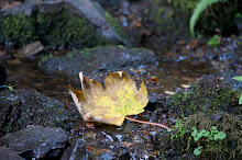
Having wittled it down to the final 10 shots I feel that this collection not only gives an insight to the many autumn colours but also focuses on the detail of the plants and leaves at this time of year.

I love the detail in the leaves of this plant and composed the shot to maximise this using a small aperture to blur the background making the detail the main focus. The lighting when taking the shot couldn't have been better with no harsh sunlight a cloudy day helped ensure perfect exposure.


Despite having taken shots in this area with and without the tree in view I decided to choose this shot as not only does it show all the great colour contrasts of the autumn leaves but the bark of the tree adds texture and pattern to the shot, making it more interesting to look at.  It also creates a scene as well of where the leaves have come from.


I liked how this tree was so imposing in the composition and how the sunlight is breaking through the many branches creating pockets of sunlight and shadows on the autumn leaves on the ground.


This caught my eye and I had to capture it, to me it was like the ivy was holding on to the last leaves of Autumn and the contrast of colour on the grey really stood out.


Another hidden gem of Autumn lying in the undergrowth along with the fallen leaves.  I liked the sunlight coming through the branches of the trees above giving just enough light to spotlight the chestnut as the focal point  and highlighting its spikey exterior adding texture to the shot.


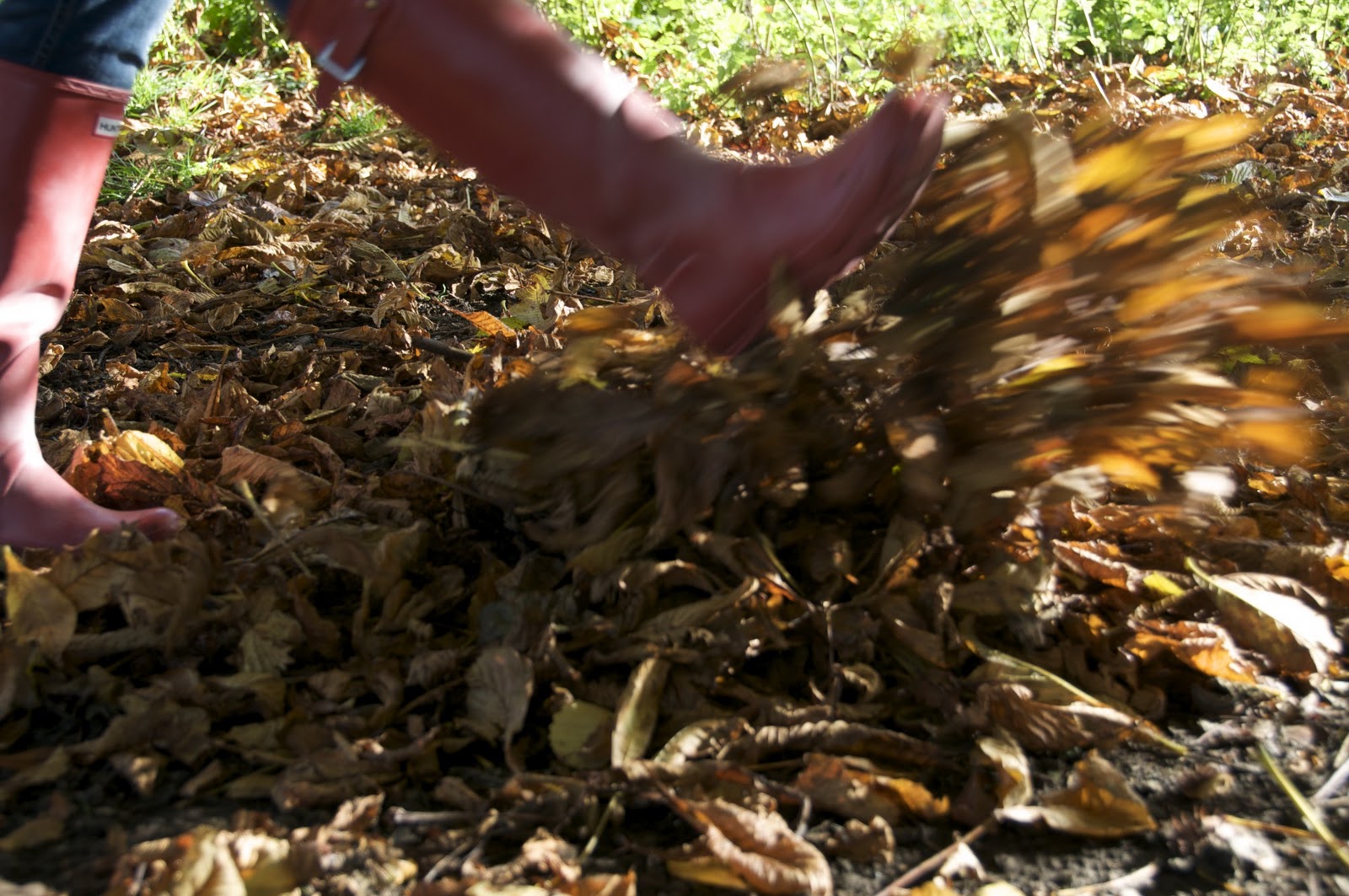
One of the first things I think about when I think about Autumn is kicking the fallen leaves so this just had to be one of my shots.  After a few attenpts and trying different shutter speeds to get the best effect here is my final shot.  A slow shutter speed helps show movement in the leaves and from thefoot kicking them.


This was a real find, the detail of the toadstool as the main focal point is great bringing pattern and texture to the shot.  To add interest the toadstool was offset in the image so as not to make the composition too formal. 


As discussed in the comparison of this image alongside Charles Binns this was a shot I knew I wanted to recreate and I was lucky that the weather with the sun shining bright enabled me to capture the fantastic colours of the leaves with the sun glaring through.


Again a great little find growing out from behind an old stone wall and despite not showing Autumn as regards colours this is a plant of the season and I love the soft blossom and contrast of it against the green grass and blue sky.


A common site during the Autumn months and great as a focal point when composing a shot, the contrast of the green against the fallen brown leaves and the nut inside, with the spikey exterior adding texture to the image.

Module 211: Image Presentation

There are a number ways of presenting photography images, the method chosen will usually depend on what the image is and the thought behind the shot, the audience and the media it is to be presented in.

For my image presentation I have chosen my blog due to ease and accessibility, there is also very little safety hazard with this type of presentation unless anything goes wrong with the computer electrics.

If I was to present my final images in any other way it is likely I would choose portfolio or exhibition.

Exhibition would be good way of bringing my full collection of Autumn and Fashion images together and to enlarge them to their full potential.  However portfolio would be another choice of mine as despite the advantages of the digital world we live in I still find portfolios and albums a far more personal way of viewing shots.  Obviously this method requires an appropriate lay out and mounting may also be used to present the images at their best.

Possible Presentation Methods:


Magazines:


Magazines are a great outlet for advertising and editorial style shots to be shown on a small scale either in colour or black and white.  It may be that some of my fashion/shoe shots could have been used within this type of media.  Alternatively my Autumn shots may have fitted well for an editorial piece in a magazine such as Derbyshire Life focusing on the time of year within a certain area.  Obviously this is a difficult area to get into and often you will gain access to this area of photography through reputation or having worked your way through the levels with a particular magazine.

Gallery/Exhibition:


Galleries are usually used for long term exhibiting or as an outlet for selling images.  This medium is fantastic for exhibiting your images on a larger scale and giving people the chance to come and view the work on display.  Exhibitions are often used for short term display with invites being sent out or advertising in local press for people to come and view your work as a general collection or a more focused collection such as fashion, people, landscapes, portraits, etc.  Again getting this type of exposure is often difficult to gain and is more likely to be well known photographers such as Joe Cornish and Dennis Morris that will use this type of media.


Photobooks:


Photobooks are fast becoming the modern way to produce a photo album but without the messing around.  Printed in house and shipped out these are a great way of putting together a gift for someone or as a professional a photobook is an extremely slick way of presenting your work.  There are few negatives with photobooks other than the lack of flexibility when maybe wanting to change some of the images included, but overall a perfect way of presenting images.

Canvas and Acrylics:

 Your Photos On Acrylic Prints

Canvases are used in a number of different ways, in the home, in galleries and for exhibitions.  Acrylics are also another way of presenting images with the advantage being that the image is protected by the acrylic, however this also creates a glossiness so it would really depend on the finish you want as to which you would choose.

Digitally:


With the vast array of technology available digital media is becoming a much more common way of presenting and viewing images whether it be on a large scale on plasma screens or on a smaller scale such as digital photo frames, with technology such as iPads becoming a method of choice for professional photographers, especially those doing weddings to present image to their clients.

Saturday 15 January 2011

Theme 1: Autumn-Comparisons

Taking an image from Charles Binns a well known and extremely talented and respected photographer and looking to understand his work and create my own interpretation was no mean feat, but here's the result:


I loved the way in Binns shot that the sunlight was shining through the leaves enhancing the Autumn colours.  Fortunately for me the day I headed to Calke Abbey was beautiful, crisp but sunny enabling me to get a similar effect. If I was to shoot this again I don't feel I would change anything, I like the fact that my sho is a little more focused on a smaller collection of leaves, however Binns shot does give some height perspective where mine doesn't but overall I am very pleased with the outcome of this shot.

Theme 2: Fashion/Shoes - Comparisons: A Modern Twist on a Classic

From the beginning of this course there was one image I wanted to shoot following inspiration from Horst P Horst and below is the result:


Being on location as opposed to being in a studio has introduced a number of different elements, some may say causing more distraction in the composition, however in my head used the barred gate I wanted to take the sexiness of the image and give it almost a Chicago twist to contrast with the model and set a scene, creating almost a story behind it.  If I was to take this shot again I may choose to do it in the studio and play a little more, for instance I also see this shot in black and white possibly with red shoes showing as the only colour in the shot.

However overall I am pleased, I like the tones in the shot and the modern twist to the type of dress my model is wearing, although Horst P Horsts image for me has true class and despite no props for setting a scene has real feel of the rock and roll era about it or maybe even earlier.

Knowing Your Settings

Once the shots have been taken no one would be expected to remember the settings the image were taken at so this is a great way of checking and viewing the settings being used.

Thursday 13 January 2011

Theme 2 - Final Image Choices

Again quite a bit of narrowing down to do but here is the selection I will be choosing from:


Theme 1 - Final Image Choices

So its reached that time and despite having narrowed down the images I am looking to use for Theme 1 and my Autumn theme I still have the below images to sort through: