I hate to miss an opportunity to use my camera and so I have taken to carrying it everywhere or at least making sure it is in my car and I'm glad I did as I stumbled upon a great opportunity last Sunday to add to my Autumn theme after a visit to Hazelwood Church where I got married last year.
Here are some of the shots I took...
 |
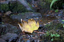
| I love the vibrance in colour of this image and the detail of the veins in the leaf, if taken again I may have tried this at night to create an image where the leaf is almost on a black background using foreground lighting to bring the leaf into view. |
 |
| Again I love the vibrance of this shot and the contrast of the leaves against the greay stone background. With this shot I used a low f/stop to obtain a short distance of focus to enable the leaf to be the focal point and the wall to blur in the background. |
 |
The composition was the main thing in this shot for me coupled with the wide range of autumn shades running through the leaves on the ground. Introducing the trunk of the treee into shot allows me to show the vibrance of the leaves against the trunk of the tree. The aim with this shot was also to use a longer focal point and not to blur the background too much so that from the perspective the shot was taken the viewer can see that these leaves were not only around the base of the tree but carpeted the whole area with colour.
 |
Thinking about a lot of the reserach I had done previsously I had to capture the wide variety of Autumn tones and colours along the ground and the great contrast between the reds and yellows.
I loved the character of this plant, the subtle curls adding shape and the contrast of the colours in the leaves. I also love how the colours in the blown out background still show the colours of Autumn while this plant is the prime shot out of a number of average trees.
It was the detail and colours in these leaves that I loved coupled with the last bit of sunset which gives a great spotlight emphasising the colours in this image.
 |
| It was definitely the variation in colour on the leaves that caught my eye with this shot. I also loved the delicacey of the detail coming through the grey background. |
This image was not a set up, it just caught my eye as I was leaving the church and I couldnt resist, the contrast in this image is fab with the yellow really standing off the dull greay background, while the ivy leaves seem to be clinging to the last of the Autumn leaves, I couldn't have placed it better myself.
Its great how the trees in this image stand off the dull grey of the building almost acting like entrance pillars framing the door of the church.
 |
| I've added this one in black and white to show why I am keeping my photos colour, as although this looks good in black and white without colour it fails to show the true feel of Autumn and the fabulous colours we see at this time of year. |


1 comment:
Hi
Lets not loose sight of the fact that these autumn images are truly lovely, so the task now is to leave these and get the same standard of work in your model and shoe theme.
Again keep on track with all your criteria labelling.
Steve
Post a Comment