It has to be said I know very little about this photographer and have found it extremely difficult to find out any information on him, I simply stumbled across his website and loved his fashion images and consequently I have collated some of my favourites below and why I like them.
I love the deep tones in this image that set apart the focal point of the model highlighted by the white pillar. The shot also seems to be uplit and taken giving height perspective to both the model and room the shot has been taken in.
Clearly a fashion shot I like how the natural light brings out the focal point of the clothing in this shot with the light fading at the models face so as not to draw the viewers eyes.
Again a great use of natural light creating a silhouette of the model with the window acting like a frame of the model as the focal point.
The use of so many light tones in this shot enable the dark tones of the model to stand out with the eye being drawn into the focal point of the models face.
The perspective of this shot is great adding height and distance to the shot while the arched windows add shape and bring natural light to the shot. The position of the model/the models pose draws the eye up her never ending legs to the focal point of the models face.
It is the perspective in this shot along with the pattern from the railings that make it with the model appearing secondary, the line in the ceiling creates symmetry splitting the shot in half.
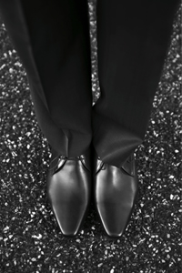
The cobbles in this shot add texture and pattern, along with the pattern of the shoes while the angle of the shot creates height perspective.
As per the previous the ground adds texture with the angle of the shot adding height perspective.
I love how the open door taken out of focus draws the eye to the focal point of the model in this shot while framing the model and adding interest to the composition.
The composition of this image is great taken from the perspective of someone outside the door looking in, shooting the doors out of focus to draw the viewers eye to the focal point. Shooting in this way also creates a one point perspective to the model, the inlet of natural light beyond the doors also helps draw the eye.
The use of the hatch frames the shoes in this shot while the colour of the floor contrasts with that of the shoes. It is also a clever part of the composition how the floor looks very worn against the smart shoes really selling the product to the viewer.


1 comment:
Hi
I would suggest that you take a model with you on a shoot to add a different dimension to the shoot.
Should be someone who can model for you over xmas, try if you can and have these images printed out with you.
Steve
Post a Comment